Here are the pictures for the assignment.
SPACE
-----------------------------------------------------------------
Deep
 |
| Selected as best example |
In this picture, it feels as if the road could go on and on.
If you look, the objects that are further away are less contrasting, when compared to the foreground where the contrast is higher. Also the lines are converging far away into the distance.
These elements create a prevalent sense of depth.
-----------------------------------------------------------------
Flat
 |
| Selected as best example |
There is not much depth in this picture. There are no converging lines, they are almost parallel.
That is why this picture best exemplifies flatness.
-----------------------------------------------------------------
Ambiguous
 |
| The best example of Ambiguity |
The picture is the best example of ambiguity because it does not resemble anything too similar. It uses reflections to convey that unclear and confusing feeling.
You are not quite sure what you are looking at.
Limited
 |
| Best Example |
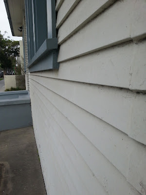
The picture above has both elements of flatness and depth. The lines converge towards the center but then stops and goes flat.
-----------------------------------------------------------------
LINE
Direction of Movement
 |
| Best example |
The lines in this picture are pointing upwards. It leads the eye to the top. At the same time smaller lines are moving against the flow and is going to the right. This creates a contrast in the direction of movement.
-----------------------------------------------------------------
Orientation
 |
| Best Example |
The lines in this picture are all in different orientations. There are diagonal lines pointing towards the sky on the fence while the fences are all pointing towards the ground.
At the same time the cable lines are also in a different orientation. They are converging towards the bottom of the picture.
-----------------------------------------------------------------
Quality of Line (Straight or Curved)
 |
| Best Example |
This striking image of a bulb highlights the quality of line of the bulb. It is thick and curvy.
-----------------------------------------------------------------
Tone
-----------------------------------------------------------------
Contrast
 |
| Best Example |
There is a huge contrast between the light emitting from the light bulb and its surroundings.
-----------------------------------------------------------------
Affinity
 |
| Best Example |
The values in this picture are very similar. The difference between the blacks and whites are very minimal.
-----------------------------------------------------------------
SHAPE
-----------------------------------------------------------------
Contrast
 |
| Best Example |
The picture above has many different shapes. The main focus is the contrast of angular shapes versus the fluid and curvy shapes.
-----------------------------------------------------------------
Affinity
 |
| Best Example |
The rectangular shapes in these buildings create a sense of uniformity. They are very constant in the sizing of the shapes.
-----------------------------------------------------------------
Color
-----------------------------------------------------------------
Contrast of Brightness
 |
| Best Example |
The brightness of the yellow from the light bulb is a huge contrast to the brightness of the yellow in the lampshade.
-----------------------------------------------------------------
Affinity of Brightness
 |
| Best Example |
The green grass in this picture is almost equal in brightness.
-----------------------------------------------------------------
Contrast of Hue
 |
| Best Example |
Orange and Blue are contrasting colors. The orange in this picture stands out against the blue background.
-----------------------------------------------------------------
Affinity of Hue
 |
| Best Example |
The colors in this picture are harmonious. Oranges, reds and yellows work well together. Thus this picture shows an affinity of hue
-----------------------------------------------------------------
Contrast of Saturation
 |
| Best Example |
The saturation of the yellow on the "Body Shop" sign is higher than the yellow below it. This creates a contrast of saturation.
-----------------------------------------------------------------
Affinity of Saturation
 |
| Best example |
The reds in this picture are of similar saturation. They are all a bit desaturated.
-----------------------------------------------------------------
End


The selection of images conveys an appreciation of the terms used to describe visual composition. The image with the fence and powerlines is most captivating. Here are a few observations:
ReplyDeleteFlatness - Second picture, with glass doors in an alcove, conveys a strong sense of the finite nature of the view, while the reflection in the window gives added depth to the image. It does stand in contrast to the depth of the alley way in your first Deep Space image. The contrast of small bricks against large windows detract somewhat from the flatness, though. The third picture with the Egyptian decorations on the walls, conveys flat when the left half is viewed, especially when viewed as a contrast to the depth of the tree on the right.
Ambiguous - It is easy to identify the ambiguity in the first and third images. Does the ambiguity in the second stem from the multiplicity of story lines one might imagine for the scene? (person by tree - sense of being lost)
Limited - Image of house is very limited, almost two dimensional in a 3D space
Line - The fence image tells many stories and has both affinity of line and contrast.
Orientation - The last, best example is particularly captivating. It conveys a sense of confusion with so many choices in orientation, leading both toward and away from the power lines, appearing to connect the powerlines and fence, drawing attention to the distance yet to the bottom of the image. Almost as though the view is one from a dazed person who has just been stuck down by an electrified fence.
Tone - The mosque image is full of contrast. The intersecting lines of the rows of prayer rugs and the red carpet leading to them, then the circular mosaic and sunlight, and the mezzanine and vent space at the top of the wall that combine straight walls with curved corners. Plus the shadows at back and the sunlight trying to illuminate the shadows. There is a lot going on here.
Do the light bulb images also convey tension between light shining out and the structure holding the bulb in place?
Affinity of hue - good eye for color
Was this completed as a team project? Just checking!
ReplyDeleteNo it wasn't. It was completed individually. Kevin will post his pictures on the blog soon.
Delete